Pages

Saturday, June 28, 2014

Crazy Birthday Card

I am guest posting today over at Stampotique Designer's Blog for one of our design team members Coby. Her grandson is sick so please say a prayer for him. 

I have a close friend that has a birthday coming up (pretty soon, need to get this in the mail LOL) and I wanted to make her a card using my wonderful Stampotique stamps. She loves the weird characters of Daniel Torrente and Jill Penney so of course I had to use my fun stamps


For this card I used Stampotique Stamps

Prom Queen and Froggie by Daniel Torrente and Jill Penney


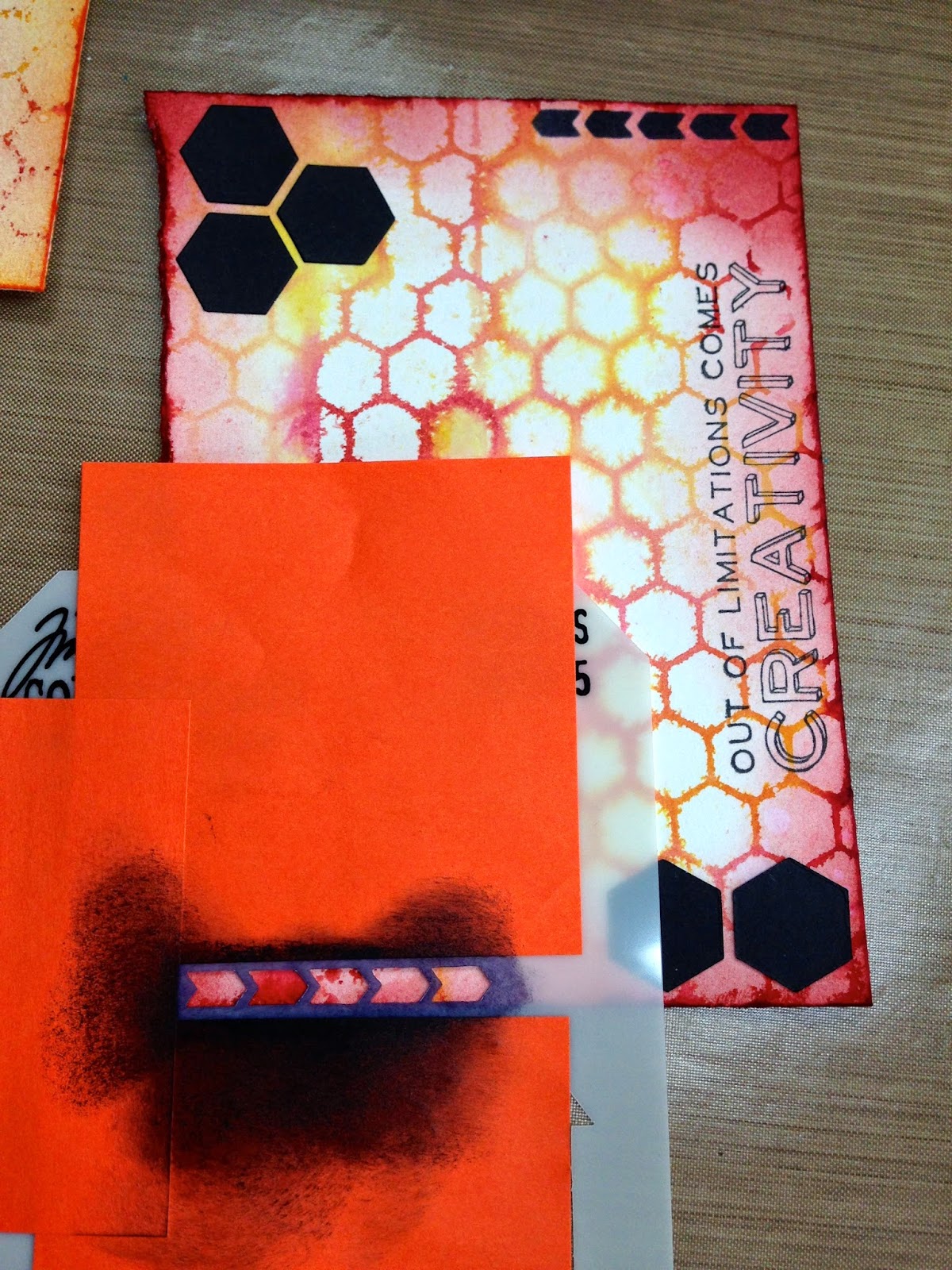
I created my background with Tim Holtz distress paints and then added a few stencils

Both girls were colored with copic markers and then adhered to the front of the card. 


This was a fun card to make because my friend and I are always kidding each other about how much we are alike and how crazy and weird we both are, haha! These Stampotique character stamps were so perfect for this.
Thanks for coming by once again and have a wonderful day.

Thursday, June 26, 2014

Artist Trading Block - TIME

I'm so excited to share with you today an Artist Trading Block that I have created. As some of you may know my favorite style of media is Steampunk and I did an ATB awhile back with steampunk in mind
(Warning, this post is photo heavy)


Well, I wanted to do another steampunk-ish/Time block but this time I really wanted it to be clear or see through
You can find Eileen Hull's Artist Trading Block along with all her dies HERE

I decided to use some of the thick clear packaging that I have saved from misc things I've bought
(yes, I save it all LOL)

I cut my ATB out of this packaging material and then embossed it with an embossing folder


In order to emboss each section of the ATB I had to put the embossing folder into the machine sideways and this way I can emboss each section without overlapping


For the middle section of the ATB I had to use a shim so that the middle would emboss but the other two sides would not
This was the result, each section of my ATB is embossed and there is no overlapping or wonky clocks


Next I simply colored my embossed sections with alcohol inks


For the Time plate to open I simply used paper on the back and created a piece that would swing open
(I created this plate with a Ten Second Studio texture plate, metal tape and black paint)


This piece of paper was adhered to the back of my plate and then onto my ATB front (I used red line tape for this)

I then used some grungeboard letters and painted those black with acrylic paint to create my "Time" word for the top of my ATB. I also used redline tape on the back to adhere those


For my flowers, I used Wendy Vecchi's set of clearly for art flowers and stamped this with various Tim Holtz stamps using archival ink


Once dry, I used various colors of alcohol ink to color them and heated them up to shape them

Here are several photos of my finished Artist Trading Block

The first photos are without the light


I figured that these photos would eventually be changed to a photo of Derek and I and our two girls, I just didn't have time to find the perfect photos and print them in the sepia tone


 Now the Photos with the light source under the ATB


I'm going to have to get one of those light stand for my ATB, the kind that turns. 

I hope you liked my creation today and please make sure to check out Eileen's Art With Heart June Challenge, this month it's all about "Summer Celebrations" you could win a wonderful Sizzix prize pack.

Also, hop on over to The Artists On The Block Blog for some more wonderful design team inspiration, there is so much wonderful talent on this design team!!

Thanks for coming by!!

Wednesday, June 25, 2014

Stampotique Challenge SDC 153 - Anniversary/Love

Well hello there and welcome back to another new challenge over at Stampotique's Designers Challenge Blog


This week our wonderfully talented Kim Howard is our hostess and she has chosen the theme "Anniversary/Love"


I really love this because my husband and I just had our 17th wedding anniversary on the 21st 
I was thinking of him when I made this journal page.

I used Stampotique Stamps

Daniel's Hearts, Calendar Squares and Angel Boy - By Artist Daniel Torrente
Barcode Text - By artist France Papillon

I used my Dylusions spray for this background and I love how the right side of the page came out sort of splotchy. It was a happy mistake.
I also used some Tim Holtz stencils on the righthand side of the page.


I just love the colors blue and purple together like this page. So pretty and bright! I hope you enjoyed the page and please consider partaking in our challenge this week.
Thanks for coming by and have a wonderful rest of your week

Monday, June 23, 2014

Playing around with Dina Wakley's New Paints

I'm so excited, I just got my hands on some of the new Dina Wakley paint and I couldn't wait to bust it open and start using it.
Of course in my excitement I didn't take photos of my process but in my defense, all I really did was paint my page and use some stencils and stamps so it wasn't too in depth. 
I must say that I love the paint and they are fun to play with, everything on this page is from Dina Wakley, stamps, stencils and paint


The handwriting is my own, that's not a stamp LOL


Thanks for stopping by, I hope you have enjoyed my fun page.
Have a great week

Wednesday, June 18, 2014

Stampotique Challenge 152 - Sentimental (Words or Phrases)

Hi there, and happy Wednesday to you. The week is half over!! YAY! It's my turn over at the Stampotique Designer's Blog

Today I wanted to share with you a project that I made for the new Challenge over at Stampotique Designers Challenge Blog. Our hostess this week is the ever fabulous Gez Butterworth
Gez has chosen the theme Sentimental (Words or Phrases) this week.


I go over to Pinterest all the time to collect words and phrases and quotes that I just love and that I want to use in my projects and this one just stood out to me for this project.

I used Stampotique Stamp

Prom Queen - By Artist Daniel Torrente

I had this leftover background from a project that I have been working on. It just didn't turn out the way I wanted it to but I left it laying on my craft table because sometimes things like this just inspire me. It had been sitting there for weeks and It just stood out to me for this project. 
I love it when that happens.


It's not the most beautiful background but it's definitely got character. Can you see the little heart in the background there?
I had created this background with Tim's Distress Paints and a paper towel, I dabbed the background while it was still wet with the paper towel and it made this interesting look

I simply colored my "Prom Queen" with distress markers and cut her out and pasted her on top of my background. 
I also used a new Dina Wakley Stencil and distress ink to create the "word boxes" on the right


So what do you think? Should I draw around the heart with a black fine tip marker to make it stand out more? I love that it was created randomly, let me know your thoughts.

Thanks for coming by and we hope to see your own project over on the Designers Blog this week. 
CHEERS!!!


Tuesday, June 17, 2014

Compendium of Curiosities 3 Challenge #4

Hello all and welcome back.  I missed the 3rd challenge over at Linda Ledbetter's Studio L3 and I didn't want to miss another one. I just love partaking in these challenges because it takes me back to the Tim Holtz styles, which I truly love. 
This time the host is The Funkie Junkie Boutique they are giving away a 25.00 gift certificate to one lucky winner!!
There is also a prize pack directly from Tim Holtz and Mario! YAY!! So two great ways to win!

For this challenge we are working on page 49 of Tim's book A Compendium Of Curiosities Volumn 3 if you buy the book it's chock full of techniques including this one


This one goes over layering Tim's stencils and texture paste, how much fun is that? I love stencils so this challenge was right up my alley.

Here is my submission for this challenge...


I hope you will stop by again tomorrow for my Stampotique Design team post!! Have a great day!

Sunday, June 15, 2014

12 Tags of 2014 - June

Hello all, thanks for coming by today
I have been working on my Postcard for this month's Tim Holtz 12 Tags of 2014, make sure to check it out HERE
This months tag is so gorgeous and I love the technique Tim used with his stencils and watercolor paper


I had so much fun with this month's postcard (I'm making postcards each month) that I ended up making three.

I did three very different backgrounds
One was done on regular manila card stock (far left)
The middle one and far right were both done on watercolor paper but they were done on different brands of watercolor paper. This paper was sent to me by a friend and you can see that the piece to the far right was way more absorbent
This gives you a good idea on how the technique Tim used turns out differently on different paper


I used the same color distress stains for the two on the right and a few other colors for the manilla card stock, I actually like how they all turned out

I then used distress inks to go around the edges and also the middle of each background

I embossed each of my main images with black embossing powder and I then colored them with distress markers and a water pen


I used various Tim Holtz stencils, distress inks and die cuts to create background images
While using the stencils I use sticky note paper to mask of portions that I don't want in my background (see below)


Here are my three finished postcards


I love how each background was created the same but each one turned out very different
I am going to enter the dragonfly postcard here


in the following two challenges

Our Creative Corner - The Challenge over there is "Flaming June" based on a photo by Lord Frederic Leighton

A Vintage Journey - Their Challenge is "Wings and Things"

Make sure to check out both challenges if you have some time and also be sure to stop by Tim Holtz's website to get a full tutorial on this months tag.